Digital Eye Strain Starts With Reading Itself
Reading suppresses complete blinking on screens and paper. Screens then add luminance, viewing-distance, image-quality, and flicker variables.
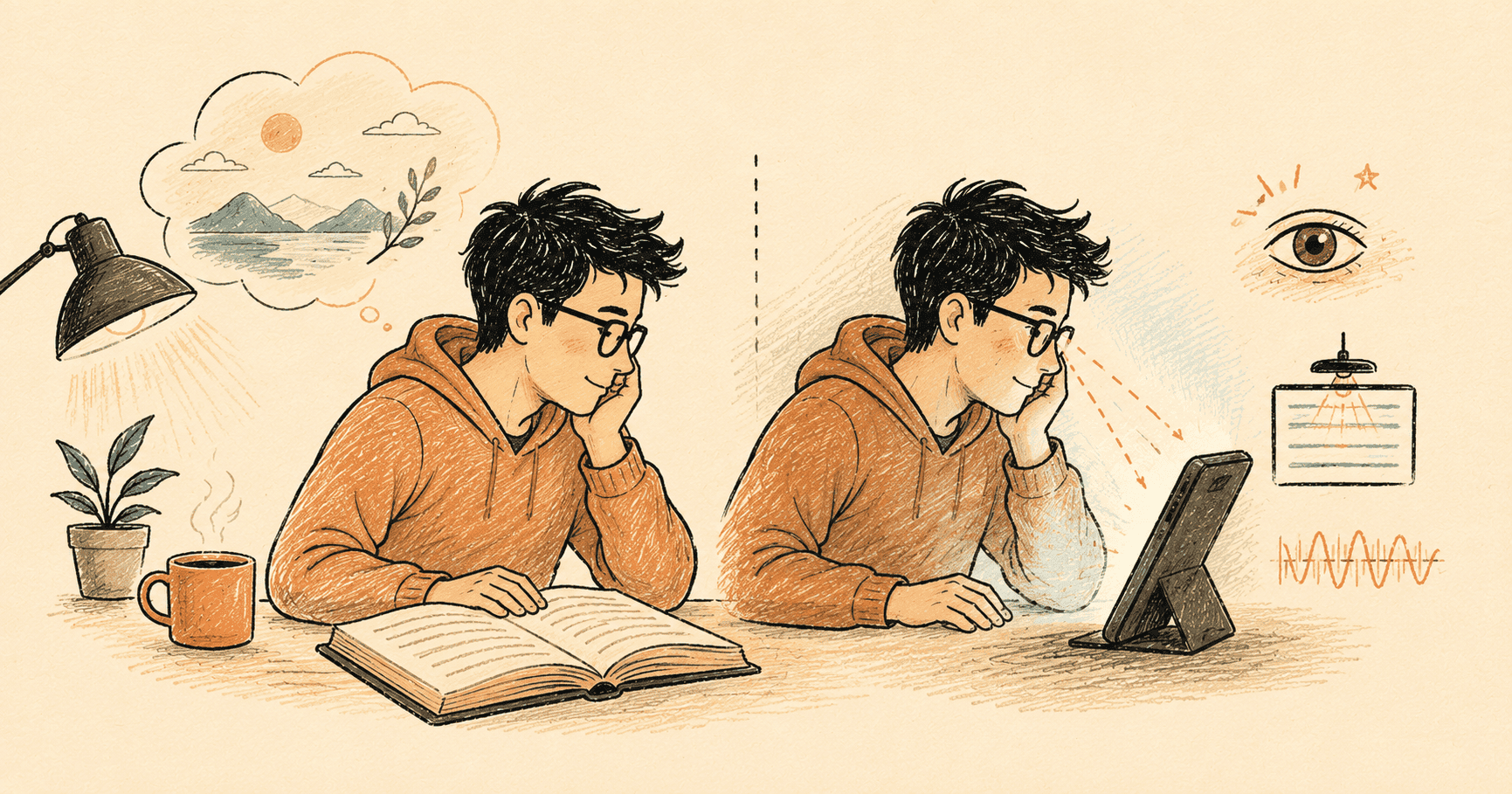
I spend enough time reading from screens that I wanted to understand what makes long sessions uncomfortable. The usual answers are blue light, dark mode, and the 20-20-20 rule. The evidence points to a more useful distinction.
The dominant driver is not uniquely digital. Sustained reading is a demanding visual and cognitive task. Concentration can suppress complete blinking whether the words are on glass or paper.
Screens then add their own variables: absolute luminance, shorter working distances, image quality, and hardware flicker. “Digital eye strain” combines a reading problem with several genuinely screen-specific problems.
That is the thesis I missed when I first looked at the individual studies. It also resolves an apparent contradiction in the evidence: the strongest symptom pathway may barely be digital at all.
The evidence behind those paths is uneven. Digital eye strain has no single objective endpoint, and many of the individual experiments are small. I distinguish replicated findings from small or hardware-specific results as I go.
Digital eye strain is still a useful name for the symptoms: dry or irritated eyes, blurred vision, difficulty refocusing, headache, and discomfort around the eyes. It is less useful if it makes me assume the screen is the only cause.
The largest pathway starts with reading
People often say that screens reduce blinking. That happens during demanding computer work, but the display itself is not the whole explanation.
In a controlled study, Chu, Rosenfield and Portello asked 25 people to read the same text from a monitor and from paper. Size, contrast, viewing distance, angle, and luminance were matched. The blink rate was not significantly different: 14.9 blinks per minute on the computer and 13.6 on paper.
The quality of the blinks did change. Incomplete blinks rose from 4.33% on paper to 7.02% on the computer.
That is important because a complete blink spreads the tear film across the eye. An incomplete blink leaves part of the surface exposed. In a separate study of 21 people, incomplete blinks correlated with post-task symptoms. Simply prompting people to blink more did not significantly reduce those symptoms.
The result is more interesting than “screens make us forget to blink.” Cognitive demand appears to suppress blinking during reading. The screen-specific difference in this comparison was blink completeness, not blink frequency.
There is no settled intervention yet. In the 21-person study, an audible prompt more than doubled the mean blink rate but did not significantly reduce symptoms. More blinks are not necessarily better if they remain incomplete or interrupt concentration.
The strongest positive evidence is newer. Xu and colleagues randomly assigned 40 university students to use a blink-training app or receive no intervention for 30 days. The intervention group improved on Ocular Surface Disease Index scores, blink rate, incomplete-blink percentage, Ocular Protection Index, and tear-film stability.
That result makes complete-blink training promising rather than disproven. It is still one small, unmasked study with a passive control. It needs replication against an active or sham intervention.
For now, I would treat chapter boundaries and natural pauses as moments to notice dryness and make a few deliberate, complete blinks. That is a low-friction habit, not a clinically proven protocol.
The 20-20-20 rule is more memorable than proven
The 20-20-20 rule says that every 20 minutes, I should look at something 20 feet away for 20 seconds. It is easy to remember. Its exact numbers have little direct support.
Johnson and Rosenfield tested 30 young adults during a demanding 40-minute tablet-reading task. Participants took 20-second breaks every 5, 10, 20, or 40 minutes across separate sessions.
Symptoms increased in every condition. Changing the break frequency did not significantly affect symptoms, reading speed, or accuracy.
That does not prove breaks are useless. Standing up, changing posture, looking into the distance, or noticing dry eyes may still be helpful. It means the specific 20-20-20 prescription should not be presented as a clinically proven dose.
A small 2023 study using webcam reminders reported improved dry-eye and digital eye-strain symptoms after two weeks, but most measured clinical signs did not improve and the symptom benefit disappeared within a week of stopping.
Taken together, the break evidence is uneven. The exact 20-20-20 dose is unsupported. Blink training has one encouraging trial. Gentle reminders may help some people, but no reminder schedule has become a well-proven universal treatment.
Luminance matters more than dark mode
Dark mode is often treated as a separate eye-care feature. A more useful way to think about it is as a way to control absolute luminance, or how much light the display sends toward the eyes.
Light text on a dark background usually emits less total light than dark text on a bright background. That can feel better in a dim room. In a bright environment, a light background may improve acuity because the higher luminance constricts the pupil and increases depth of field.
This is why studies of contrast polarity can appear contradictory. Buchner, Mayr and Brandt varied polarity and luminance independently. When overall luminance was equal, the usual performance advantage for dark text on a light background disappeared. Luminance, not polarity by itself, explained the result in that experiment.
The comfortable level also depends on the room. Research does not support one brightness percentage for every device and environment. It supports a curve:
- Under less than 1 lux, Na and Suk found a preferred luminance around 10 cd/m² for the first view, gradually rising to about 40 cd/m² for continuous viewing.
- A 2021 evening-reading experiment placed its fitted comfort range around 20.63–75.15 cd/m² for ambient illumination around 13.08–62.16 lux.
- For an office example at 500 lux, ISO 9241-303 notes a commonly recommended display luminance of 100–150 cd/m².
These are not medical thresholds. The Na and Suk result came from subjective judgements and physiological proxies in a dark laboratory. The Zhou study had 33 participants and covered evening conditions. The ISO figure is an office example using positive polarity. Together, they show the direction clearly: brighter surroundings call for a brighter display.
I therefore think about dark and light themes as luminance controls, not universal winners. I want to avoid a bright white display in a dark room without dimming the screen until the text becomes difficult to resolve.
A brightness slider is not a scientific measurement. The same percentage can produce very different luminance on different devices.
Flicker is real, but it is hardware-specific
Many displays change brightness by switching light output on and off very quickly. This is called pulse-width modulation, or PWM. At lower brightness, some OLED displays keep each pulse off for a larger part of the cycle.
Here the evidence needs a precise split. Low-frequency temporal light modulation in lighting is linked to headache, eyestrain, unwanted visual effects, and impaired performance. What is not established is that typical OLED PWM is a population-wide cause of digital eye strain. Panel behaviour, frequency, waveform, exposure, and individual sensitivity vary.
IEEE 1789-2015 makes the frequency–modulation relationship concrete. Between 90 and 1,250 Hz, its low-risk recommendation is:
Modulation percentage < 0.08 × frequency
At 240 Hz, that means modulation below about 19%. This is a recommended region, not a line proving harm on one side and safety on the other. The standard was written for high-brightness LED lighting, so applying it to OLED displays is an extrapolation.
Dark mode creates a trade-off here. It can reduce the page's total luminance, which is useful in a dark room. But some OLED panels achieve low hardware brightness with deeper PWM modulation. On those devices, dark mode combined with a heavily dimmed screen in bed can become the configuration with the most aggressive modulation. That does not happen on every OLED.
PWM cannot be fixed by changing a page colour. It depends on the panel and its brightness-control system. Two phones showing the same text can therefore feel different.
A sensitive minority reports strong and repeatable PWM effects. Limited population-level display evidence does not invalidate those experiences. It means the size of that group and the relevant dose-response curve are still uncertain.
Temporal dithering is another suspected issue. Some displays rapidly alternate colours to simulate shades they cannot show directly. User communities report symptoms, but there is almost no peer-reviewed research isolating dithering as the cause. At the moment it is a research gap, not an established explanation.
Blue light is the smaller question
The 2023 Cochrane review covered 17 randomised controlled trials with 619 people. Blue-light-filtering spectacle lenses provided little or no short-term benefit for eye-strain symptoms compared with non-filtering lenses.
That evidence concerns lenses, not every software colour setting. Blue light also affects circadian timing in the evening. A warm mode may help with sleep timing or perceived brightness, but it is not a proven eye-strain treatment.
Why e-ink can feel closer to paper
An LCD or OLED produces light. An e-ink display is reflective: charged pigment particles move within tiny capsules to form light and dark areas, and ambient light reflects from that surface into the eye.
Changing those particles is slower than changing an LCD pixel. E-ink devices use different electrical waveforms depending on whether they need speed, grayscale quality, or a clean reset. Fast updates can leave a faint copy of the previous page, known as ghosting. A full refresh moves the particles more completely but often causes the familiar black-and-white flash.
The trade-off is not simply “e-ink is slow.” A fast partial refresh causes less interruption but more ghosting. A full high-quality refresh produces cleaner text and images but more visible flashing.
In a 2013 prolonged-reading study, an LCD tablet produced more subjective visual fatigue than an e-ink reader or paper. The study found no significant fatigue difference between e-ink and paper.
That is not the whole literature. Siegenthaler and colleagues found broadly similar reading behaviour and fatigue on modern LCD and e-ink devices. Mean fixation duration was 205 ms on e-ink and 204 ms on LCD: a one-millisecond difference. They argued that image quality may matter more than the technology label.
A study of adolescents reading across electronic devices reported less favourable saccadic measures for e-ink, including more regressions in some conditions. It is a minority result, and age, device size, and image quality make it difficult to generalise. It is still worth naming because “e-ink equals paper” is not universal across populations and outcomes.
It is safer to say that e-ink can remove some emissive-display variables. It does not make eye strain impossible. A front light may still flicker, poor contrast can make text harder to resolve, and long periods of concentrated reading can still affect blinking.
Reflective LCD and transflective displays sit between these categories. Human studies exist, but the evidence is sparse, mostly older, and focused on illumination, legibility, or prototypes rather than long-duration reading and clinical eye-strain outcomes. Modern comfort claims therefore go beyond what has been established.
Typography changes the visual work
The serif-versus-sans-serif debate receives more attention than it deserves. Research does not show a reliable general advantage for either category in reading speed or fatigue.
Size, spacing, and line length are more useful variables.
Legge and Bigelow reviewed evidence for a critical print size. For normally sighted readers, the consensus is an x-height of about 0.2 degrees of visual angle. Below that point, reading speed falls sharply. At a viewing distance of 40 cm, 0.2 degrees is about 1.4 mm of x-height.
For a practical translation, that is roughly 9-point Times Roman at 40 cm. It is a lower boundary for fluent reading, not an ideal target for a long session. I would choose a size comfortably above it.
This cannot be converted into one universal CSS value. X-height can vary substantially between fonts set at the same nominal size, and the physical size of a CSS pixel varies with the device and its scaling. The useful check is whether the lowercase x-height at the eye is clearly above 1.4 mm at the actual reading distance.
Line length and spacing affect eye movements. Very long lines make the return from the end of one line to the start of the next harder. Very short lines create more returns. Atılgan, Xiong and Legge found that normally sighted readers needed about 13 characters per line to maintain 80% of their maximum reading speed. That is an absolute floor for small displays, not a comfortable target.
A range around 50–70 characters per line is a reasonable default for sustained body text. The evidence includes a tension: longer lines can be faster in some tests while readers often prefer shorter ones.
Moderate line spacing, roughly 1.4–1.5 times the font size, can make line tracking easier. On narrow screens, ragged-right text avoids the uneven word spacing that full justification can create.
Special “dyslexia fonts” have not produced reliable reading-performance improvements over familiar fonts. In Kuster and colleagues' study, 170 children with dyslexia read no faster or more accurately in Dyslexie than Arial. Most preferred Arial. A second experiment also found preferences for Arial and Times New Roman over Dyslexie.
Spacing controls have more support than unusual letter shapes. Preference still matters for comfort, but it should not be presented as a measured performance benefit.
Distance changes the focusing demand
Phones are often held closer than printed books. Bababekova and colleagues measured mean distances of 36.2 cm for text messages and 32.2 cm for web pages.
The distance can shrink during a session. Long and colleagues followed 18 young adults reading from a smartphone for an hour. The mean across the session was 29.2 cm. It fell from 30.6 cm in the first ten minutes to 27.8 cm in the final ten. Participants who moved the phone closer also tended to report a larger increase in symptoms.
That difference changes the demand on the eyes. Focusing demand is the inverse of distance in metres:
- 40 cm requires about 2.5 dioptres
- 29 cm requires about 3.4 dioptres
The eyes must also turn inward more at the shorter distance. Larger text can encourage a person to hold the device farther away, while tiny text often pulls it closer. Distance is therefore connected to typography rather than being a separate posture problem.
In "Why do we test at 40 cm?", Rosenfield questions whether the conventional clinical distance represents how people actually use phones. He does not call 40 cm obsolete. His point is that clinicians should account for habitual device distances rather than assuming one standard.
Persistent blur, double vision, headaches, or strong symptoms can also reflect uncorrected vision or binocular issues. Those causes are outside what display settings can solve.
Paging, scrolling, and comprehension
A small eye-tracking study by Öquist and Lundin found paging faster than scrolling or rapid serial visual presentation, with no comprehension difference. Paging keeps lines stable while the eyes perform their usual fixations, saccades, and return sweeps.
The study had only 16 participants and predates modern high-refresh touchscreens. It is useful evidence, but not enough to declare that paging always beats scrolling. A modern comparison of smooth scrolling and paging remains an open research question.
Comprehension is a different outcome from eye strain. I include it because a comfortable reading session still fails if the medium, presentation, or time pressure makes the material harder to understand.
A 2018 meta-analysis combined 54 studies with 171,055 participants and found a modest paper advantage, with Hedges' g of −0.21 for digital reading. Its subgroup estimates were −0.32 for expository text and −0.04 for narrative text. Under time pressure the difference was −0.26, compared with −0.09 for self-paced reading.
Clinton's independent 2019 meta-analysis reached a similar result across 33 studies and 2,799 participants: g = −0.25 overall, −0.32 for expository text, and −0.04 for narrative text. It also found no reliable difference in reading time and better calibration of comprehension on paper.
That result should not be turned into “screens make us understand less.” The effect is modest, varies by task, and combines many kinds of screens and reading environments. The clearer lesson is that self-paced reading matters, especially for technical or expository material.
What this changed for me
I started by asking what a screen was doing to my eyes. I ended with a better question: which part comes from reading, and which part comes from this particular screen in this particular room?
I cannot honestly claim that one measured variable caused my own discomfort. I did not record my blink completeness, screen luminance, viewing distance, or PWM waveform. The research does tell me what to test instead of guessing.
First, I would separate the reading load from the hardware. I would use chapter boundaries to relax focus and make complete blinks. I would keep the text large enough that I do not pull the phone closer as the session continues. I would match brightness to the room using the luminance studies as anchors, not treat one slider percentage as universal.
Then I would compare devices. If one OLED repeatedly causes symptoms while an LCD, e-ink display, or another OLED does not, flicker or image quality becomes a more plausible explanation. A strong individual response can be real even when population-level OLED evidence is incomplete.
The answer is not that screens are harmless. It is that sustained reading creates the largest common pathway, then screens add controllable and hardware-specific load. That distinction is more useful than blaming blue light, prescribing a rigid timer, or declaring one display technology safe for everyone.